CorePressable
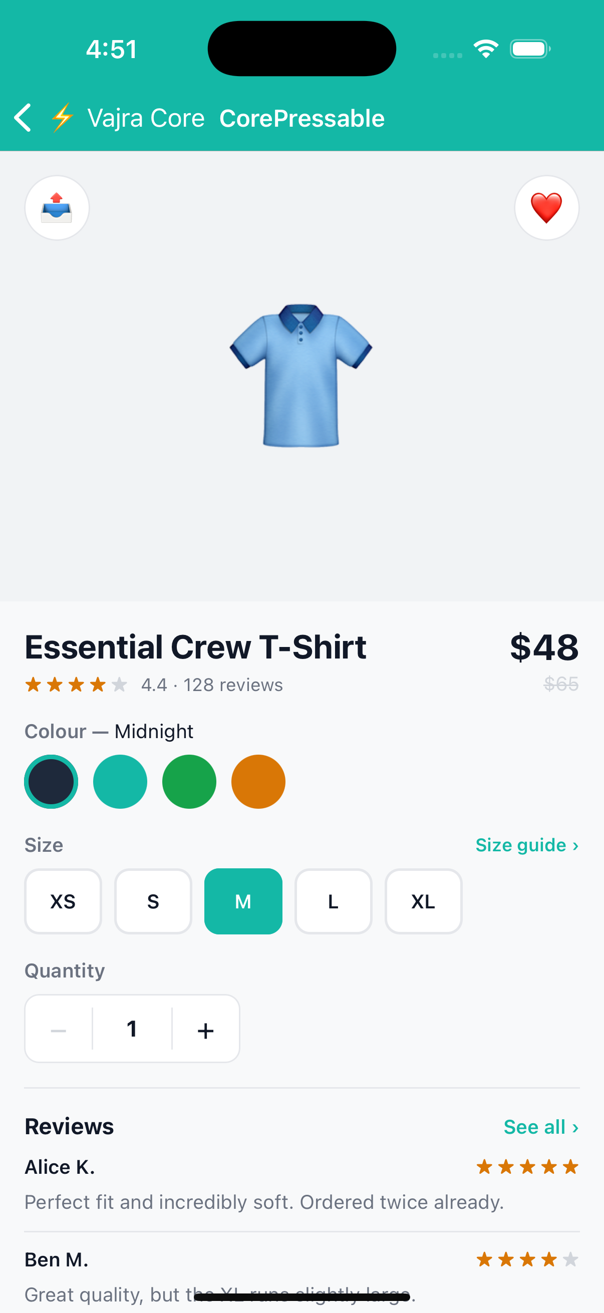
Headless TouchableOpacity with Box layout props. No default visual, all styling is up to you. Use it for buttons, list rows, cards, and any tappable surface.
Preview
Confirm
import { CorePressable, CoreText } from '@devraj-labs/vajra-ui-core';

<CorePressable onPress={handlePress} bg="#2563EB" rounded={8} p={14} align="center">
  <CoreText fontSize={15} fontWeight="600" color="#fff">
    Confirm
  </CoreText>
</CorePressable>
Usage
import { CorePressable, CoreText } from '@devraj-labs/vajra-ui-core';

<CorePressable onPress={handlePress} bg="#2563EB" rounded={8} p={14} align="center">
  <CoreText fontSize={15} fontWeight="600" color="#fff">
    Confirm
  </CoreText>
</CorePressable>
API
Accepts all Box props combined with all native TouchableOpacityProps.
Key interaction props
| Prop | Type | Default | Description |
|---|---|---|---|
onPress | () => void | — | Fired on tap |
onPressIn | () => void | — | Fired when press begins |
onPressOut | () => void | — | Fired when press ends |
onLongPress | () => void | — | Fired on long press |
disabled | boolean | false | Prevents interaction |
opacity | number | — | Static opacity of the element |
activeOpacity | number | 0.7 | Opacity while pressed |
style | ViewStyle | ViewStyle[] | — | Additional styles |
Example