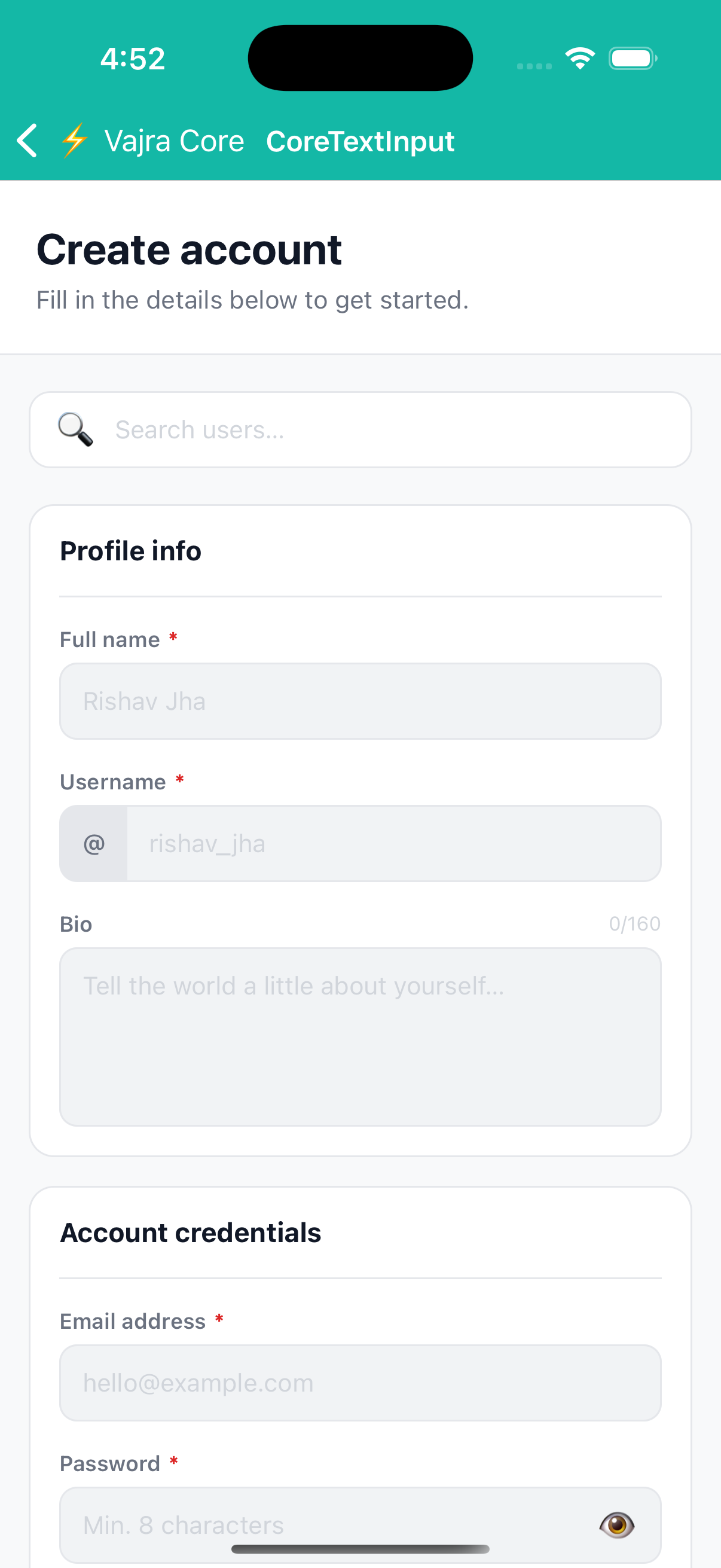
CoreTextInput
Headless TextInput with a subset of Box layout props and typography props combined. No default border, background, or font, style it entirely via props.
Supports ref forwarding.
Preview
import { CoreTextInput } from '@devraj-labs/vajra-ui-core';

<CoreTextInput
  p={12}
  rounded={8}
  borderWidth={1}
  borderColor="#E5E7EB"
  fontSize={14}
  color="#111827"
  placeholder="Type here…"
  placeholderColor="#D1D5DB"
/>
Usage
import { CoreTextInput } from '@devraj-labs/vajra-ui-core';

<CoreTextInput
  p={12}
  rounded={8}
  borderWidth={1}
  borderColor="#E5E7EB"
  fontSize={14}
  color="#111827"
  placeholder="Type here…"
  placeholderColor="#D1D5DB"
/>
API
Layout props
| Prop | Type | Maps to |
|---|---|---|
w | DimensionValue | width |
h | DimensionValue | height |
m mx my mt mb ml mr | number | margin variants |
p px py pt pb pl pr | number | padding variants |
borderWidth | number | borderWidth |
borderColor | string | borderColor |
rounded | number | borderRadius |
bg | string | backgroundColor |
Typography props
| Prop | Type | Maps to |
|---|---|---|
color | string | color |
fontSize | number | fontSize |
lineHeight | number | lineHeight |
fontWeight | TextStyle['fontWeight'] | fontWeight |
letterSpacing | number | letterSpacing |
Input-specific
| Prop | Type | Description |
|---|---|---|
placeholderColor | string | Shorthand for placeholderTextColor |
style | TextStyle | TextStyle[] | Merged last |
Also accepts all native TextInputProps.
CoreTextInputdoes not accept flex or position props. Wrap it in aBoxwhen those are needed.
Example