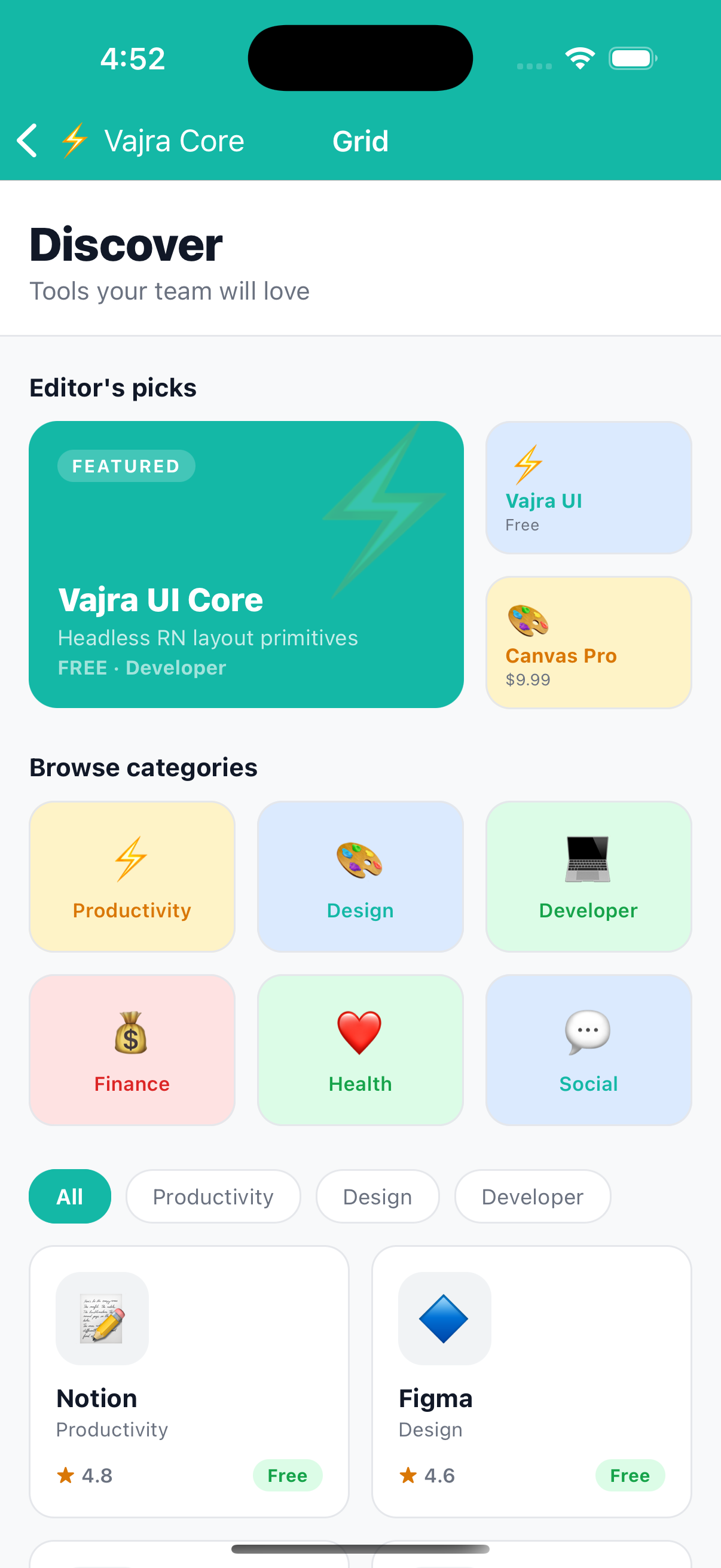
Grid
Compound component (Grid.Root + Grid.Item) for responsive grid layouts. Grid.Item calculates its own width from Dimensions.get('window'), column count, column gap, and span, items always fit exactly without manual maths. This assumes the grid fills the device's full screen width, which holds in a real app but not inside this docs page's preview card, so the live preview below uses a plain Row with percentage widths instead. The code sample is the real, correct Grid.Item usage.
Preview
import { Grid } from '@devraj-labs/vajra-ui-core';

const PADDING = 16;
const GAP = 12;

<Grid.Root columns={2} gap={GAP}>
  <Grid.Item span={1} columns={2} colGap={GAP} screenPadding={PADDING}>
    <Card />
  </Grid.Item>
  <Grid.Item span={1} columns={2} colGap={GAP} screenPadding={PADDING}>
    <Card />
  </Grid.Item>
</Grid.Root>
Usage
import { Grid } from '@devraj-labs/vajra-ui-core';

const PADDING = 16;
const GAP = 12;

<Grid.Root columns={2} gap={GAP}>
  <Grid.Item span={1} columns={2} colGap={GAP} screenPadding={PADDING}>
    <Card />
  </Grid.Item>
  <Grid.Item span={1} columns={2} colGap={GAP} screenPadding={PADDING}>
    <Card />
  </Grid.Item>
</Grid.Root>
Pass the same
gap/columnsvalues to bothGrid.RootandGrid.Itemso widths are calculated correctly.
API
Grid.Root
| Prop | Type | Default | Description |
|---|---|---|---|
columns | 1–12 | 2 | Total number of columns |
Also accepts all Box props. direction is fixed to "row" and wrap is fixed to "wrap".
Grid.Item
| Prop | Type | Default | Description |
|---|---|---|---|
span | 1–12 | 1 | Number of columns this item spans |
columns | 1–12 | 2 | Total columns in the grid (must match Grid.Root) |
colGap | number | 0 | Column gap (must match Grid.Root gap) |
screenPadding | number | 0 | Horizontal screen padding subtracted from available width |
Also accepts all Box props.
Width formula
contentWidth   = screenWidth - screenPadding × 2
singleColWidth = (contentWidth - colGap × (columns − 1)) / columns
itemWidth      = singleColWidth × span + colGap × (span − 1)
Example