useDimensions
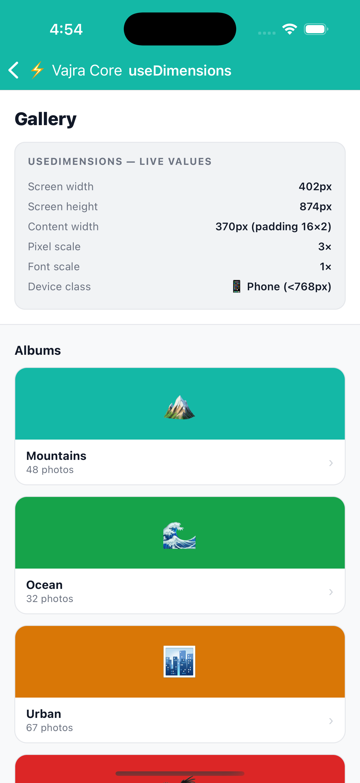
Screen-aware dimension utilities. Pass a screenPadding value to get a contentWidth that already accounts for horizontal padding, and use getItemWidth to calculate exact column widths including gaps, no manual maths needed.
Preview
width: 0
contentWidth: -32
3-col item width: -16
import { useDimensions } from '@devraj-labs/vajra-ui-core';

const { width, contentWidth, getItemWidth } = useDimensions(16);

// Width of one column in a 3-column grid with 8px gaps
const colWidth = getItemWidth(3, 8);
Usage
import { useDimensions } from '@devraj-labs/vajra-ui-core';

const { width, contentWidth, getItemWidth } = useDimensions(16);

// Width of one column in a 3-column grid with 8px gaps
const colWidth = getItemWidth(3, 8);
API
const dims = useDimensions(screenPadding?: number)
Parameters
| Parameter | Type | Default | Description |
|---|---|---|---|
screenPadding | number | 0 | Horizontal padding from screen edges (applied to both sides) |
Return values
| Value | Type | Description |
|---|---|---|
width | number | Screen width in pixels |
height | number | Screen height in pixels |
scale | number | Device pixel ratio |
fontScale | number | Device font scale factor |
contentWidth | number | width − screenPadding × 2 |
getItemWidth(numColumns, gap?) | (n: number, gap?: number) => number | Width of one column in an n-column grid |
getCustomWidth(numCols, marginHorizontal?, gap?) | (n: number, m?: number, gap?: number) => number | Alternative calculation with custom margin |
getItemWidth formula
totalGap  = gap × (numColumns − 1)
itemWidth = (contentWidth − totalGap) / numColumns
Example